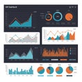
bar and pie charts illustrate data with blue orange colors the display |
||||||||||||||||||||||||||||||||||||||||
| navigate by keyword : visualizing used upward trends text template structured shows segments screenshot provide presentation poster placeholders pie percentages organ orange one lorem logo line like large labeling labeled ipsum information indicating illustrate growth format font flow drawing document divided display directionality diagram design data colors clear circle charts cartoon brand blue beneath bar arrows aigenerated advertising |
||||||||||||||||||||||||||||||||||||||||
|
||||||||||||||||||||||||||||||||||||||||
| Bar and pie charts illustrate data with blue and orange colors. The bar charts display upward trends, with arrows indicating growth. The pie charts are divided into segments with labeled percentages: one shows a large 70% section, the other with various percentages such as 10% and 34%. Arrows beneath the charts provide directionality or flow. Text placeholders like "Lorem Ipsum" are used for data labeling, indicating a design template for visualizing information in a structured, clear format. |
||||||||||||||||||||||||||||||||||||||||
|
Stockphotos.ro (c) 2025. All stock photos are provided by Dreamstime and are copyrighted by their respective owners. |
||||||||||||||||||||||||||||||||||||||||